·
A Brand Identity That Refuses to Play Nice

Jorge Medina
Unf*ck Marketing was born out of sheer frustration with the nonsense plaguing the marketing industry. This brand didn’t come to play nice—it exists to fix what’s broken, challenge outdated thinking, and bring marketing back to what it’s meant to do: create real, lasting impact.
So when it came to its brand identity, it had to be rebellious, sharp, and impossible to ignore—here’s how we made it happen.
An Irreverent Concept for a Fucked Up Industry
For the founder, one thing was clear: the brand wasn’t about her—it was the message. A rallying cry for an industry in desperate need of change. The identity had to carry the weight of this mission on its own.
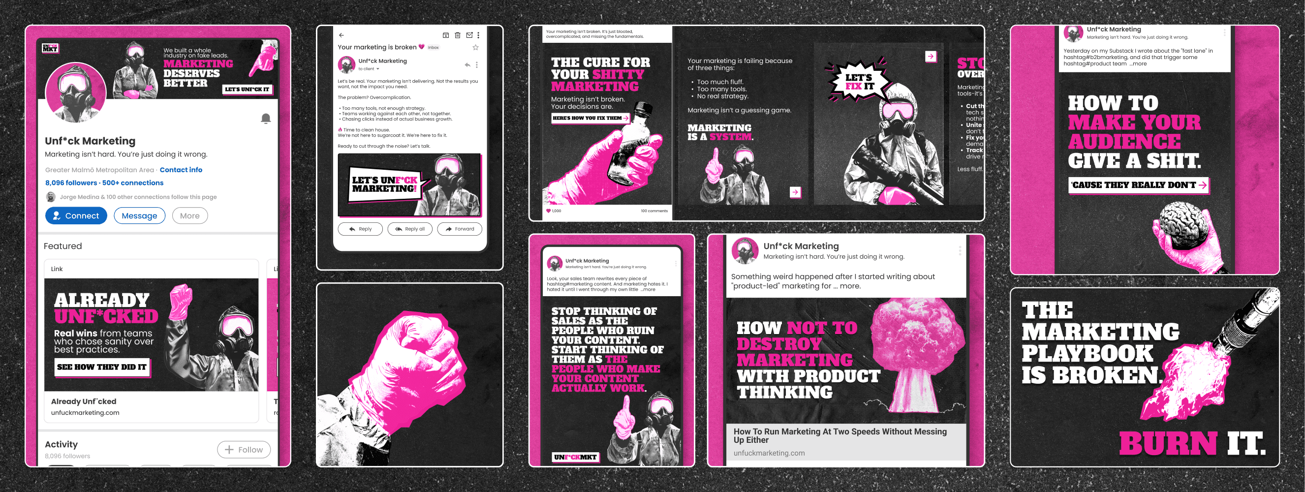
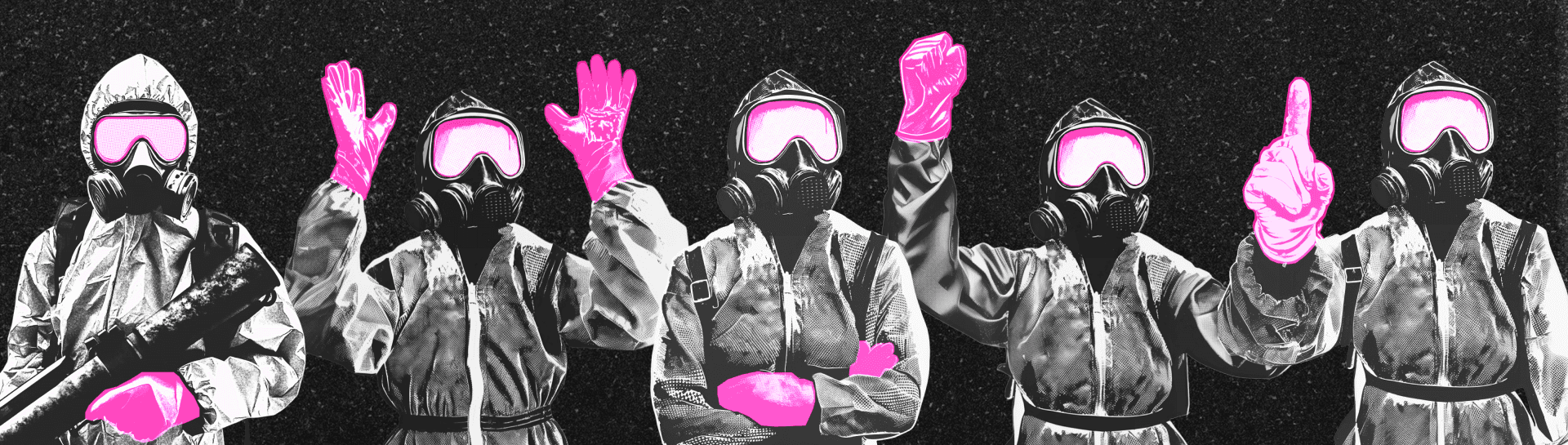
We explored her aesthetic inspirations—brutalism, grunge, and hints of futurism—while tapping into her already unconventional brand props: neon pink medical gloves, a staple in her videos. They evoked the image of a mad scientist dissecting the broken state of marketing.
From this strange mélange, a striking vision emerged: the marketing industry as a post-apocalyptic wasteland. And this brand had a mission—a crusade to clean up the mess left by misguided strategies, bloated tech stacks, and superficial practices.
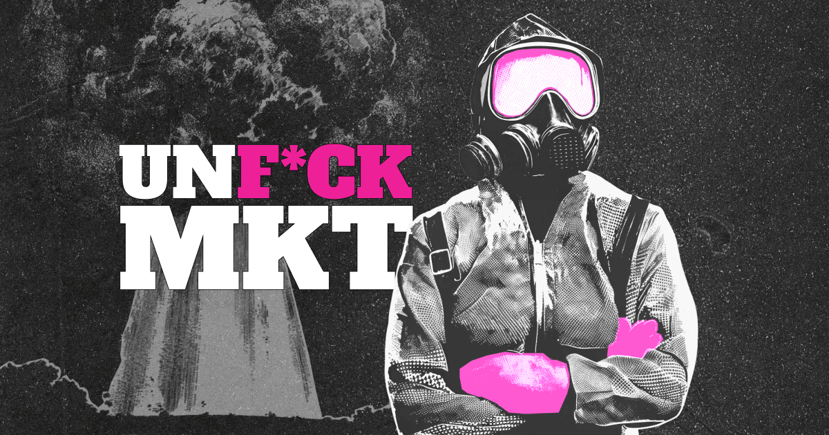
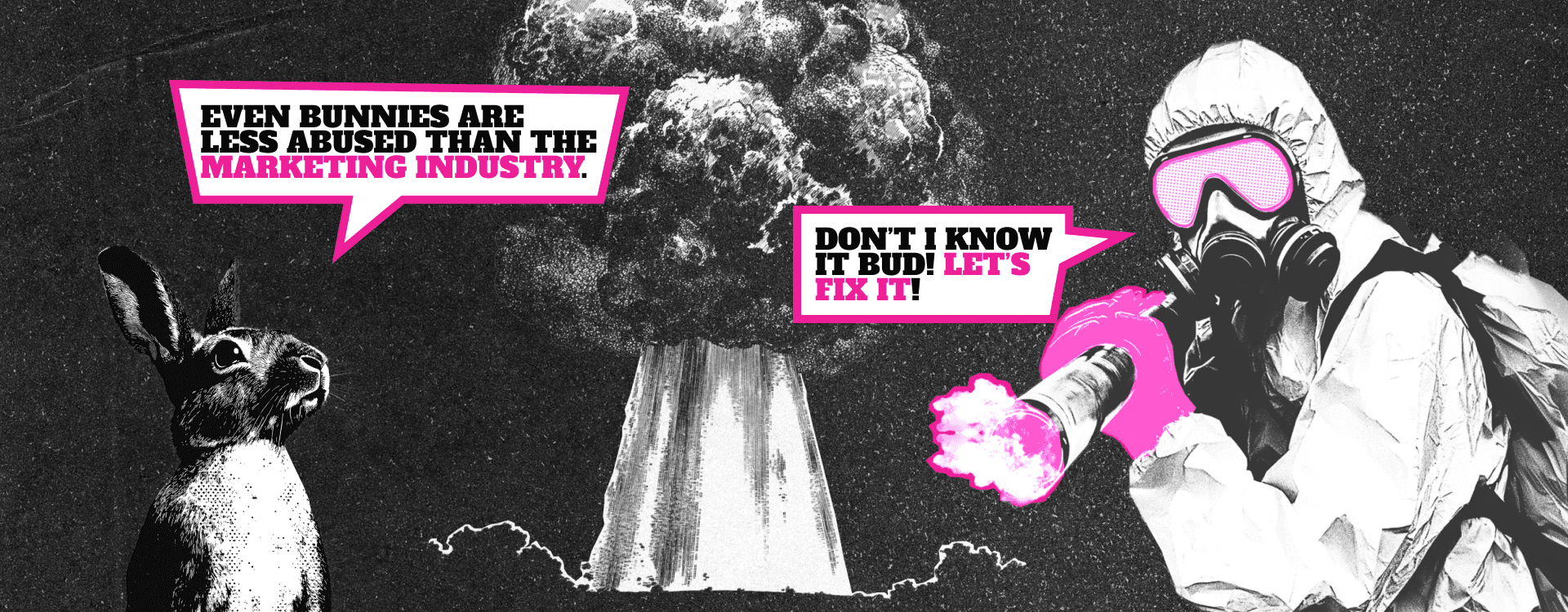
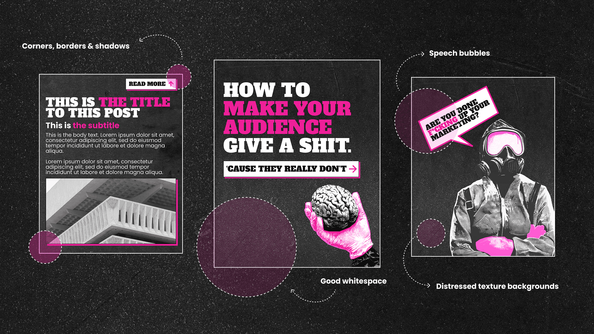
At the heart of this story, we introduced a faceless, bold hero: a woman in a hazmat suit with neon pink medical gloves, here to scrub the industry clean of inefficiencies and pretenses.

Brought to life through comic book-style halftone illustrations in black and white, she embodies the brand’s relentless drive. Whether wielding a flamethrower, commanding attention with a megaphone, or playfully interacting with a bunny rabbit, her presence is both powerful and unexpected.
The grunge aesthetic brings to life the brand’s no-nonsense approach—distressed textures, bold contrasts, and an energy that cuts through the noise. Every visual element serves a purpose: to be unmistakable, unapologetic, and utterly unforgettable.
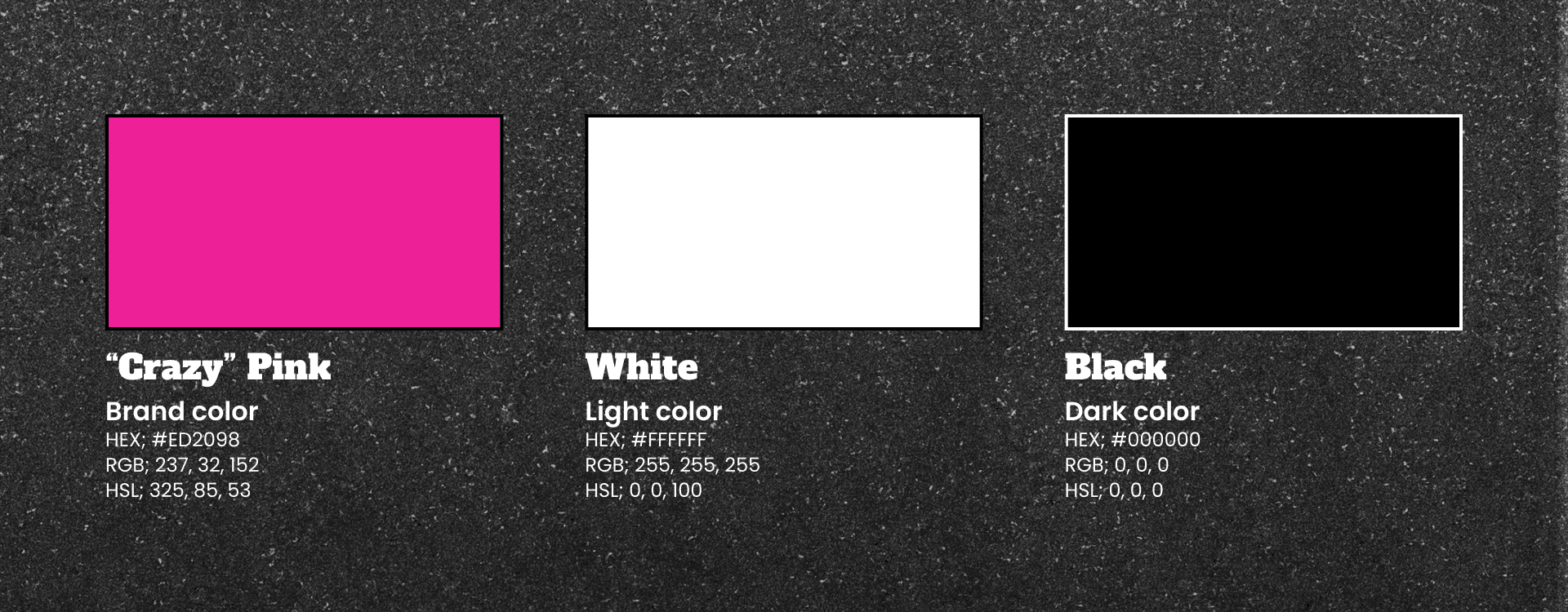
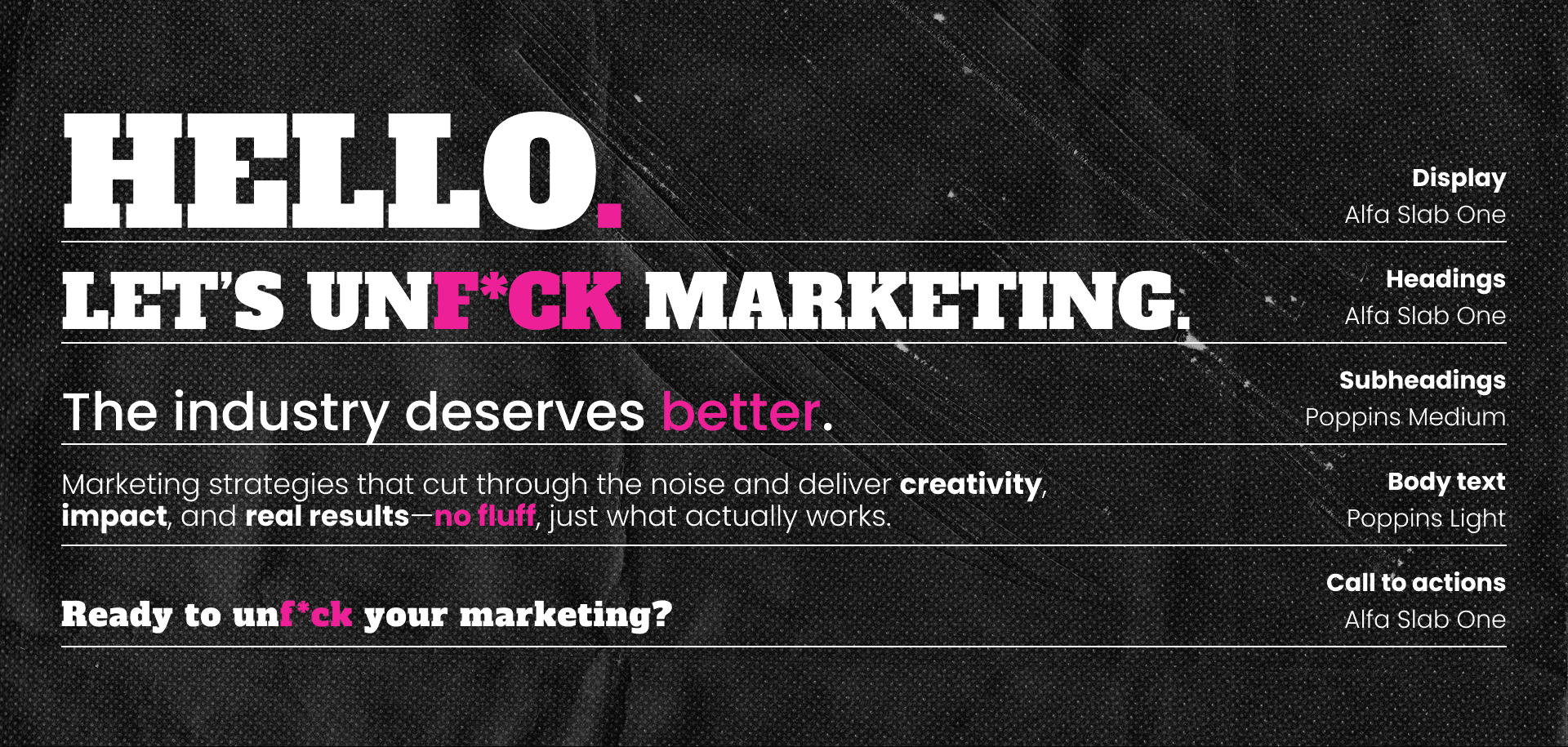
Color Palette
The brand’s palette was an easy choice. Primarily black and white—pure, striking, and uncompromising—enhanced by a signature “crazy pink” used intentionally to command attention and inject energy. This contrast ensures the brand is never overlooked while ensuring practical legibility.
Typography
A bold hero needs an equally strong voice. We chose Alfa Slab One as the primary typeface—a heavyweight, blocky serif that exudes authority and confidence. It delivers messages with unwavering conviction.
For contrast, we paired it with Poppins, a clean, geometric sans-serif. Its neutral, modern feel ensures clear communication without competing for attention, striking a balance between boldness and clarity.
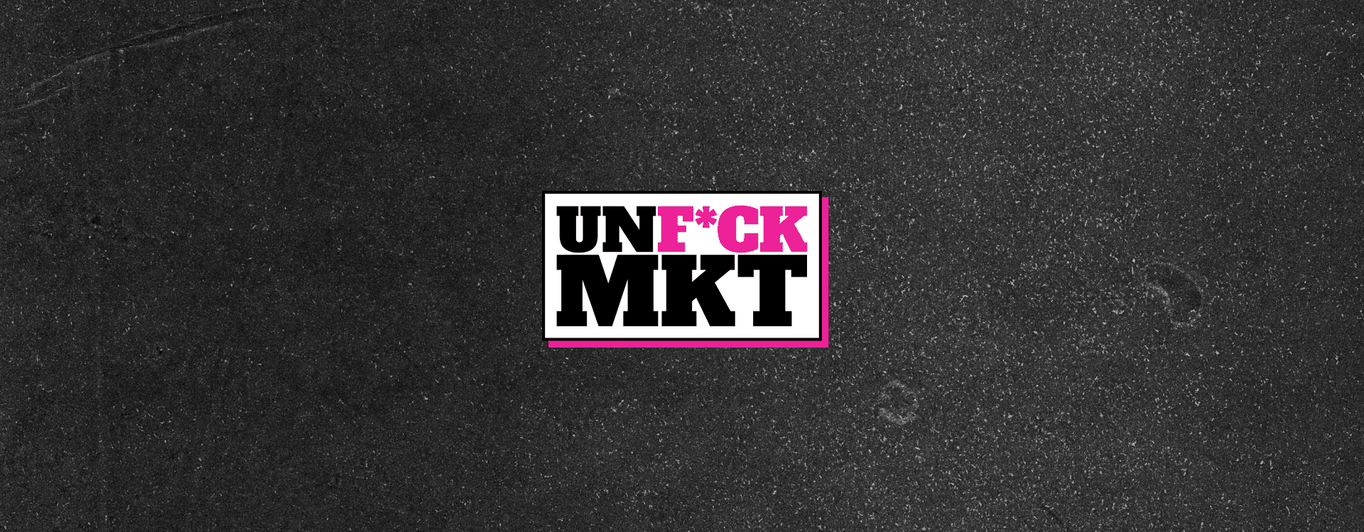
Logo
The logo embodies the brand’s fearless declaration. Using the primary typeface, it spells out “unf*ck” with “marketing” in an abbreviated, oversized format. This compact, statement-driven design makes the brand’s mission instantly clear.
Imagery
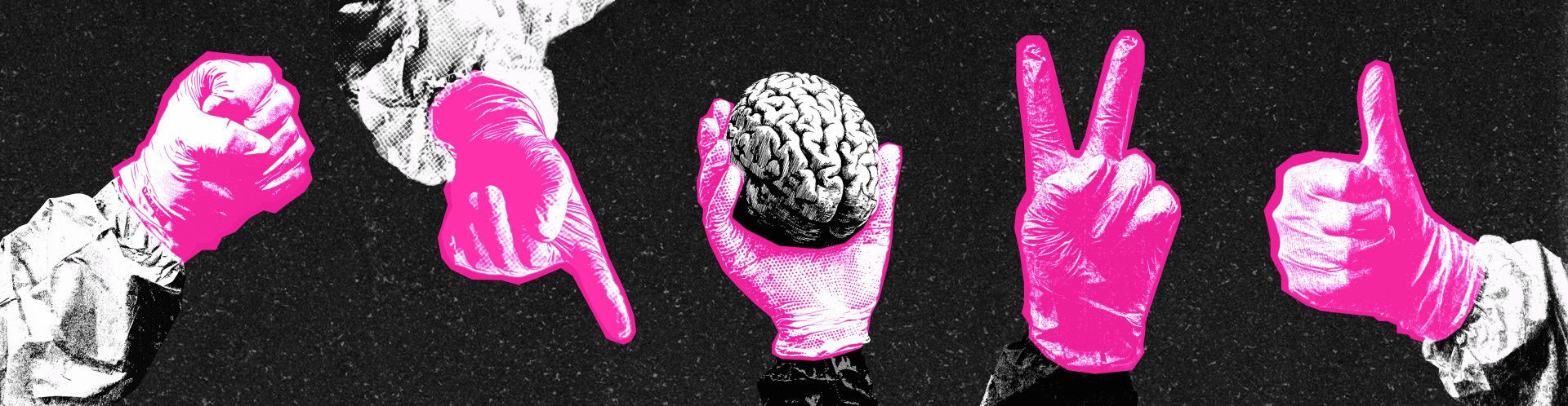
Imagery is the backbone of the identity—bold, gritty, and unafraid to stand out. The brand’s signature style was developed using AI-generated Midjourney outputs, then refined with hand-cropped overlays to highlight key areas in “crazy pink”.
To maintain consistency, we created a core set of branded assets:
The brand hero in different poses and expressions.
Her hands in neon pink medical gloves making distinct gestures.
Additional world-building elements—a nuclear explosion, lab vials, screaming mouths, a flamethrower, bunny rabbits (a nod to animal testing), and even Chihuahuas, a personal touch inspired by the founder’s love for them.
These visuals establish a brand universe that is immersive, instantly recognizable, and packed with attitude.

Graphic Style
The brand’s graphic execution further reinforces its rebellious spirit:
Bold borders and sharp edges lean into brutalist design principles, creating a raw, impactful look.
Comic book-inspired speech bubbles add a playful contrast, breaking the fourth wall to deliver witty, direct messaging.
Distressed textures in the background add depth and a tactile quality, amplifying the brand’s grunge aesthetic.
Maximalist-balanced compositions ensure layouts remain bold yet structured, using ample whitespace for clarity while maintaining an intense visual presence.
Outcome: A Brand That Can’t Be Ignored
In an industry overflowing with forgettable brands, Unf*ck Marketing doesn’t just stand out—it demands attention.
This identity transforms the brand into a cultural statement, a movement rather than just a business. The faceless hero, the unapologetic visuals, and the rebellious attitude all come together to make marketing feel urgent, visceral, and personal.
The result? A brand that breaks the mold, sparks conversations, and builds instant recognition. Unf*ck Marketing doesn’t whisper—it shouts from the rooftops, flames in hand, ready to burn outdated marketing to the ground.