·
Growth One Half-Step at a Time
Jorge Medina

Polka Dot Innovations was founded by Angela Bierman to empower senior business owners and entrepreneurs through technology. Her goal was to help them make sense of the various options that could make their businesses more efficient and scalable.
Angela steps in as their Chief Innovation Officer, digitalizing their businesses and driving growth through an approach rooted in empathy, authenticity, deep tech expertise, and passion. Crafting a fully custom, done-for-you offering.
Overview & Challenge
Angela sought a brand refresh to mark the next chapter of her business and personal brand. Her only non-negotiable? The brand had to include polka dots, given her existing brand name. Beyond that, the new identity needed to feel playful but not overly busy, convey a clear sense of approachability, and reflect Angela’s slight sassiness.
The challenge was how to creatively incorporate the polka dot pattern—a naturally busy design element—while leaving room for distinctive brand expression.

Solution
A serendipitous discovery sparked the solution to this branding challenge.
My research began with exploring the origins of the polka dot pattern, which became known as such because it gained popularity during the rise of the polka dance in North America and Europe. The dance itself derives its name from the Czech word Půlka, meaning half-step, referencing both the characteristic dance move and the 2/4 music tempo.
Angela’s business identity is driven by supportive and compassionate guidance. She often reassures clients with the phrase “It’s okay!” to ease their self-judgment, helping them progress at their own pace—one half-step at a time, without overwhelm.
This connection inspired the logo that would become the foundation for the entire brand.
An overlapping ellipse, created by a “half-step,” became the starting point. This design symbolized the essence of Angela’s work: connecting the dots for her clients. She helps them uncover what they don’t even realize they don’t know.

However, overlapping ellipses alone weren’t distinctive enough. So, we designed a custom organic ellipse that became a unique differentiator. This shape made the brand’s patterns unmistakably polka-inspired yet distinctly Angela’s. It reflected her warm, authentic personality, enhanced approachability, and subtly nodded to her passion for neurodivergence inclusion, aligning with her “It’s okay” ethos.

Thus, the new and improved Polka Dot Innovations was born.

Color Palette
We refined the original palette, reducing its clutter and making it more minimalistic, usable, and recognizable. Vibrant tones were introduced to capture Angela’s energetic personality, while a new bright orange accent was added to infuse warmth and create emphasis.

Typography
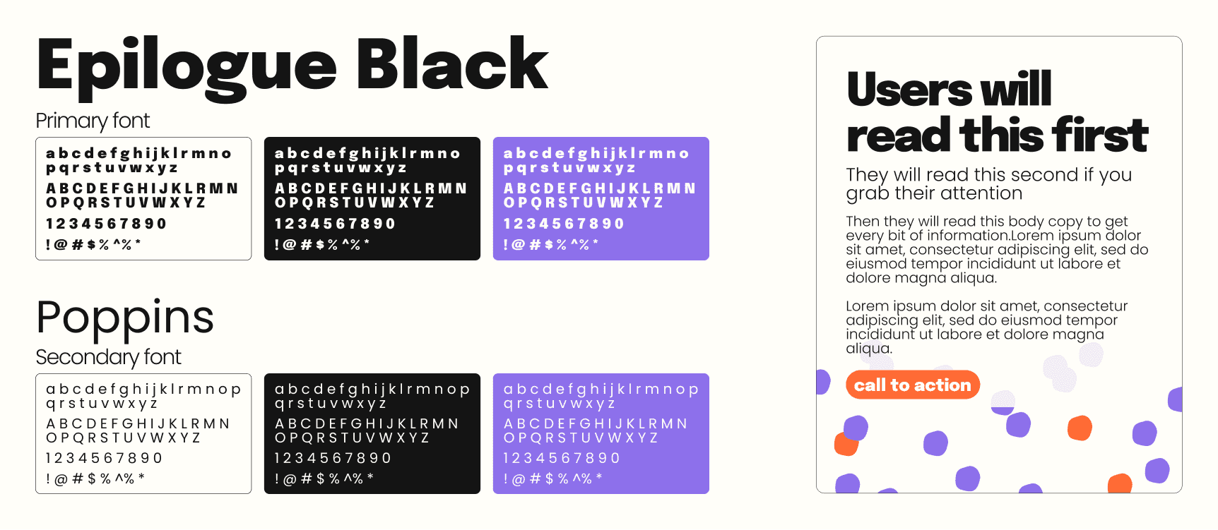
Given the inherently busy nature of polka dots, we opted for Sans Serif typefaces, known for their neutral and clean profiles, to balance the identity.
Primary Typeface: Epilogue Black, chosen for its subtle quirkiness without being excessive.
Secondary Typeface: Poppins, which maintained a connection to the original brand and offered excellent readability.

Graphic Style & Composition
The polka dot pattern remained central to the brand, but we carefully reimagined it to achieve the desired balance:
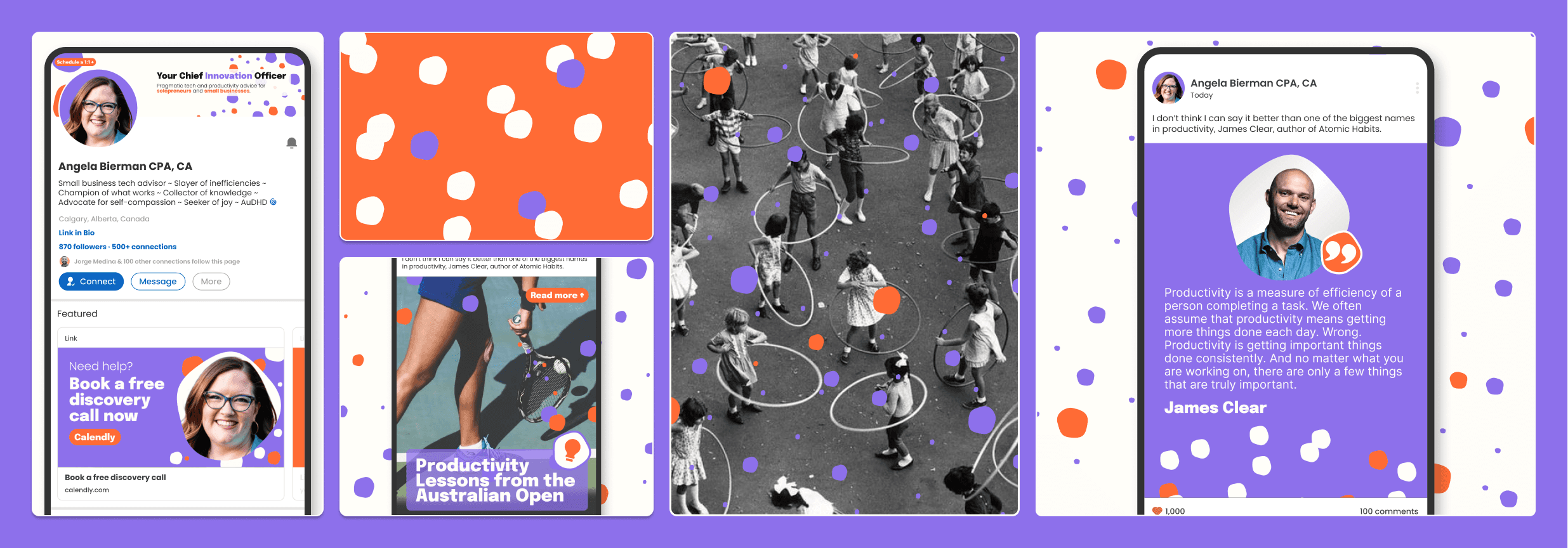
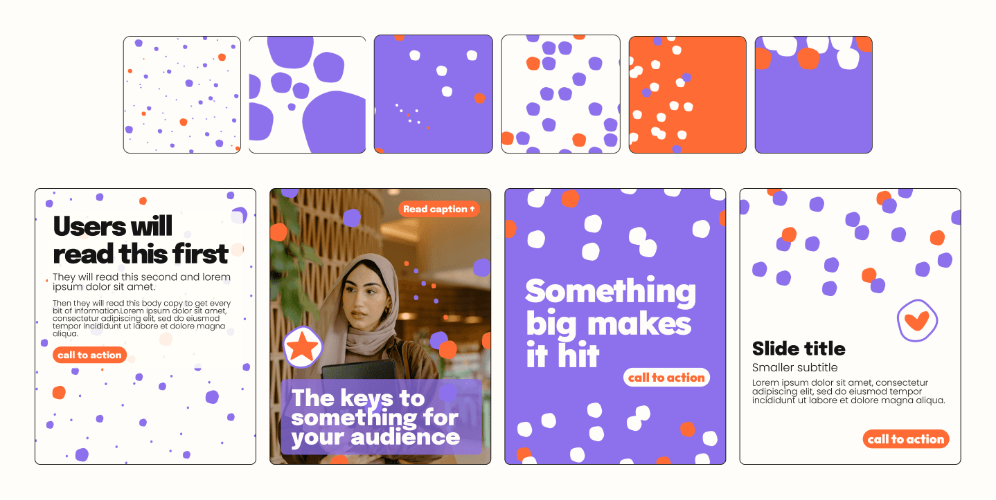
Polka dot patterns derived from the custom ellipse were created in varying densities and arrangements, providing distinct canvases with plenty of visual interest and attention-grabbing appeal.
Clean compositions were paired with these patterns to ensure the brand felt playful but not too busy. Key to this balance was the use of text boxes with 90% opacity backgrounds, which allowed overlapping content with the patterns without sacrificing readability while enhancing the sense of whitespace.
Rounded corners complemented the warmth of the custom ellipse, contrasting effectively with the straight lines of the typography.
Custom stickers featuring the organic ellipse and a fitting set of icons completed the brand’s visual system.

Outcome
The final result completely transformed Angela’s brand, aligning it with her personality and empowering her to take her business to the next level. Her identity now stands out with ease, ensuring every impression is both lasting and meaningful.


