·
From stale & corporate to vibrant personal branding

Jorge Medina

Deeply rooted in humanistic and artistic philosophy, Kizuna works with brands and individuals to realize authentic integration, alignment, and expression.
Through educational programs, community development and partnerships, advisory work, speaking engagements and masterclasses, publications, and mentorship / professional development, Kizuna reflects Grace’s wide-ranging and global experience as a leader, artist, and educator and her passion for human connection and creative innovation.
Overview & challenge
Grace founded Kizuna during the summer of 2023 and after a year of rollercoaster growth and evolution she was ready to evolve the brand into something bigger and bolder. Something that could house her multiple initiatives while feeling unapologetically hers.
We faced the particular challenge of creating a new brand identity and visual language that held some familiarity to the past while completely breaking free from it.
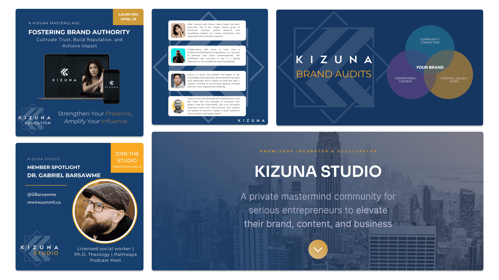
Her existing brand felt too corporate, too dark, and rigid. But she had already built strong recognition and authority around it, so the new identity was to keep her logo mark, typography, and colors. At the same time it needed to be flexible enough to allow for a number of sub-identities:
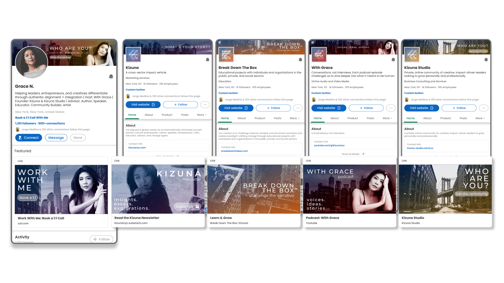
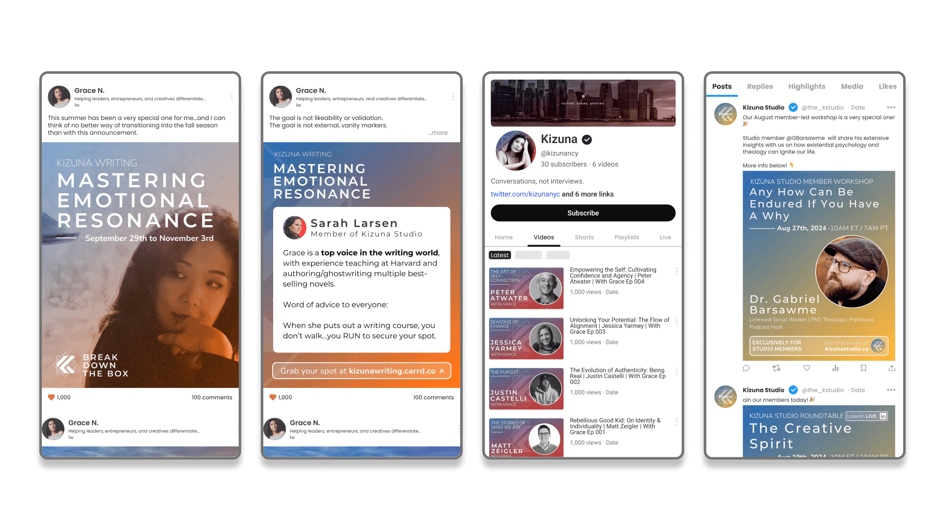
Kizuna - The main brand which Grace would also use primarily as her own
Break Down The Box - Her educational initiative
With Grace - Her podcast
Kizuna Studio - Her private online community
Solution
Through our discovery process we identified four pillars that sustained the core values of Kizuna.
Human connection
Strength, resilience & grit
Vibrant artistry and forward-thinking
Timeless sophistication
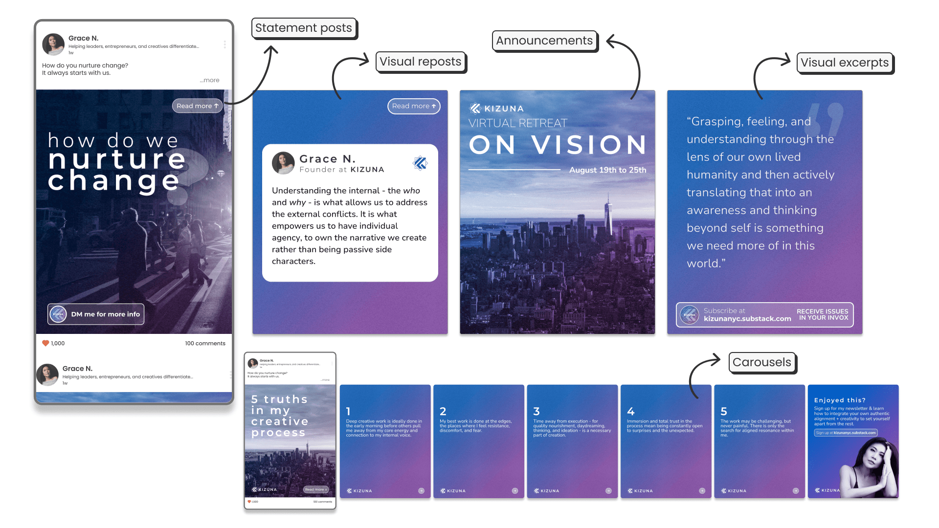
Based on these we reimagined an entirely new identity focussing on 2 main visual aspects:
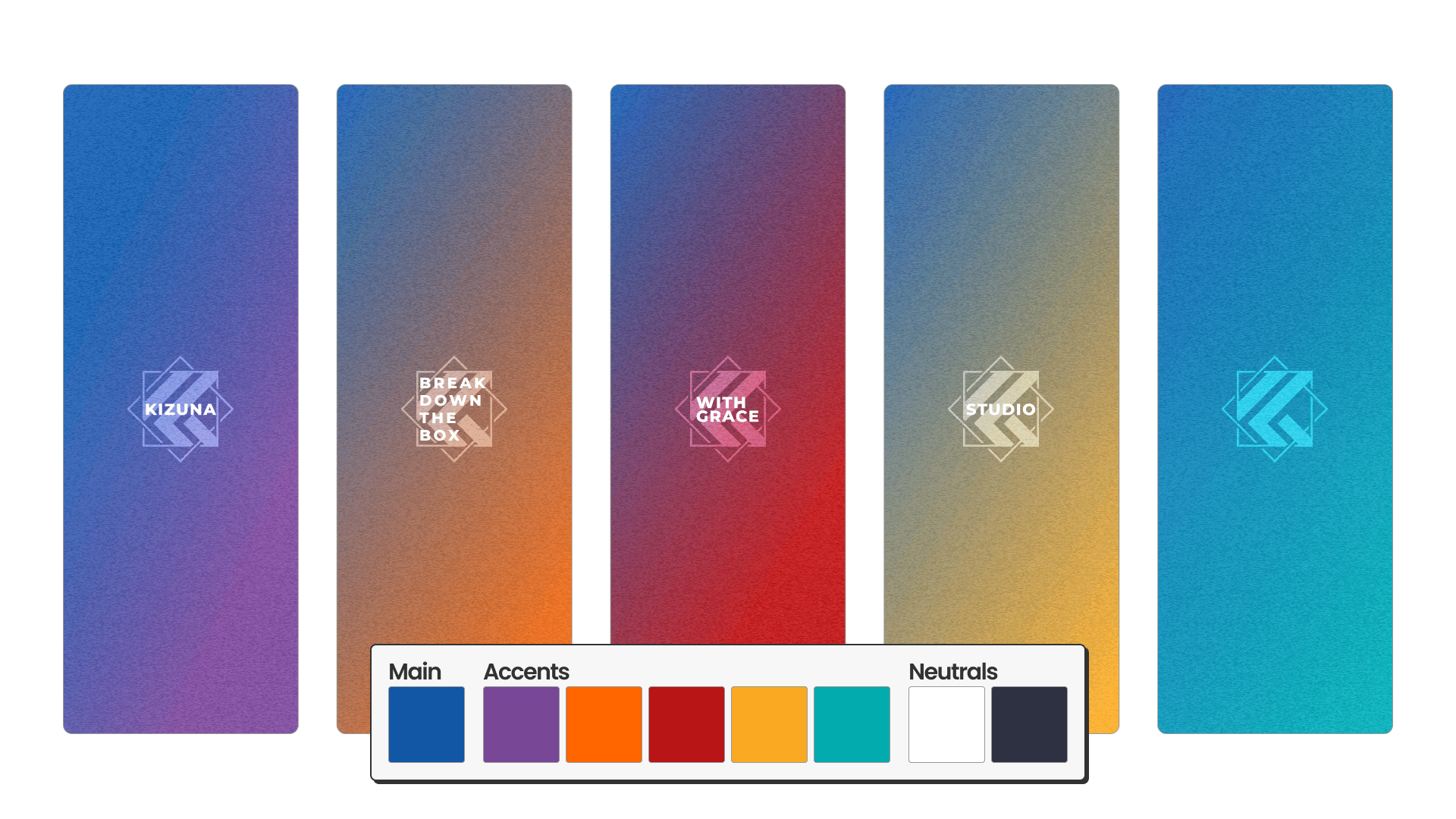
The use of color
The original identity had a consistent use of navy blue as the main brand color and purple as a main accent. The rest of the colors were used sparingly as alternative accents depending on the initiative.
We decided to make the use of gradients as a main feature of the new identity to infuse the values of connection and progressiveness (colors blending into another), and create a flexible visual system that represented the multifaceted nature of Kizuna, and therefore, that of Grace.
Keeping the navy blue as the main brand color, each sub-identity got assigned a specific gradient blending from that main navy blue into one of the accent colors.
Kizuna - Blue to purple
BreakDownTheBox - Blue to orange
Kizuna Studio - Blue to yellow
With Grace Podcast - Blue to red
That way we created a series of brands that held their own individuality while belonging to a bigger identity with the consistent use of typography, layout design, and imagery.
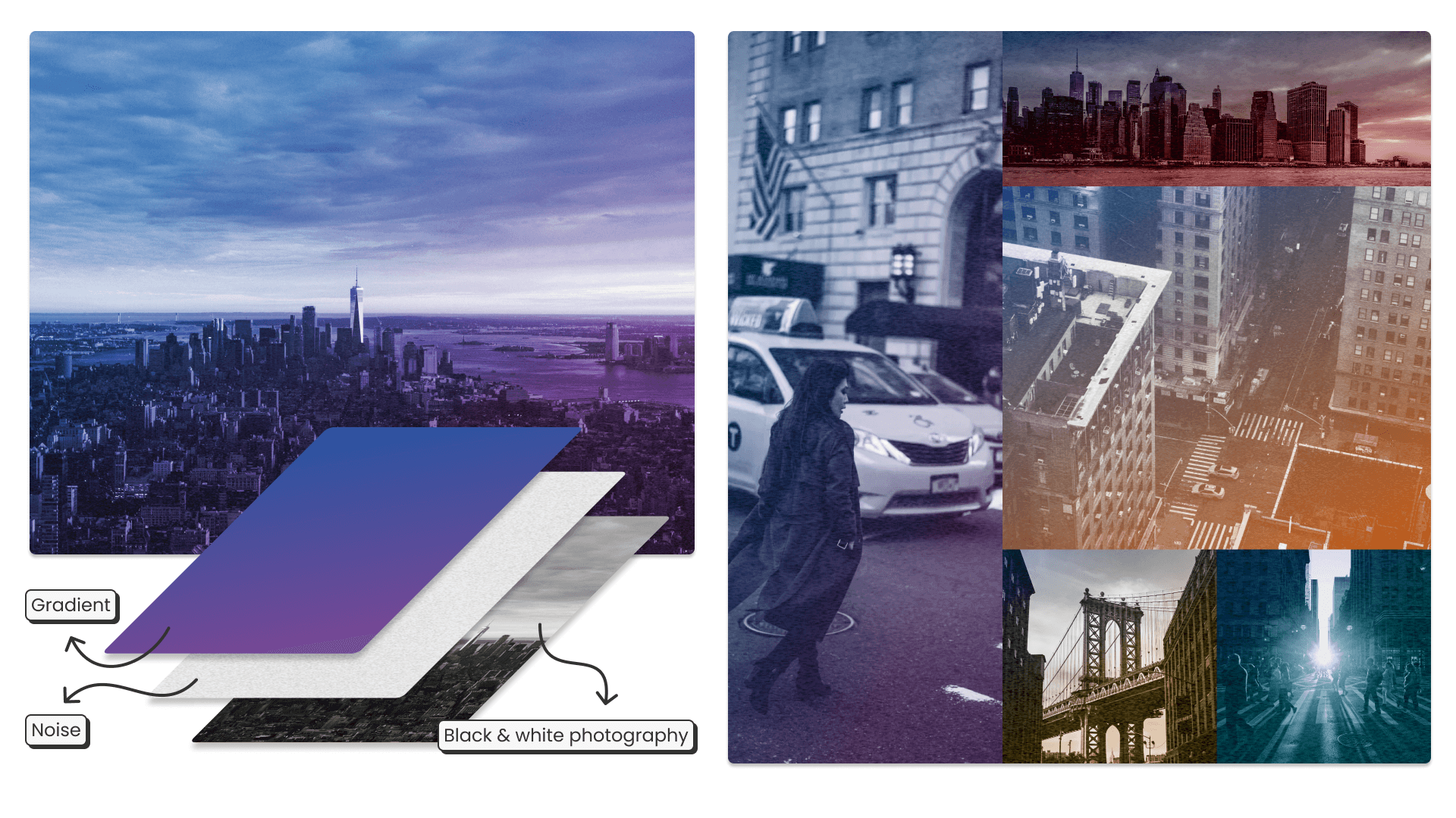
The use of imagery
Grace holds a deep connection with the city of New York. It saw her grow up through her college years and it was the birthplace of Kizuna.
The city, known as a vibrant world hub for artists and entrepreneurs that fight tooth and nail to make their dreams a reality, stood out as a deeply personal imagery choice that perfectly represented the brand values of human connection, artistry, and resilience.
To add the values of grit and timelessness we opted to always use black & white photography with added grain.
This also allowed for any images to be used while keeping the color scheme consistent throughout the brands.
Putting it all together
These decisions provided the perfect elevated canvas onto which we applied the original font pairing and minimalistic layouts that put the focus on Grace’s powerful brand voice.
The resulting brand identity system allowed to create a complete and ever expansive set of branded assets Grace will be able to use seamlessly through EasyBranding 2.0 without fear of messing anything up.
If you're interested in a new brand identity or in need of a rebranding let me know at jorge@easybranding.io!