·
A unique coaching identity
Jorge Medina
Cultivar was born from a vision for a future where organizations grow through cultivating the leadership potential within every team member. A vision rooted in a deep sense of justice and a genuine believe that, given the opportunity and mentorship, everybody can grow to become a forward-driving force within the organization.
A place of learning for aspiring leaders looking to root their growth on humanity, authenticity, respect, and continuous development.
Overview & Challenge
Chris frames his teachings and insights through outstanding analogies inspired by thriving ecosystems found in nature, breaking down very complex concepts through a unique perspective.
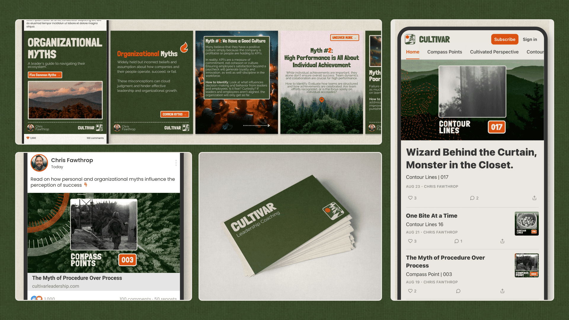
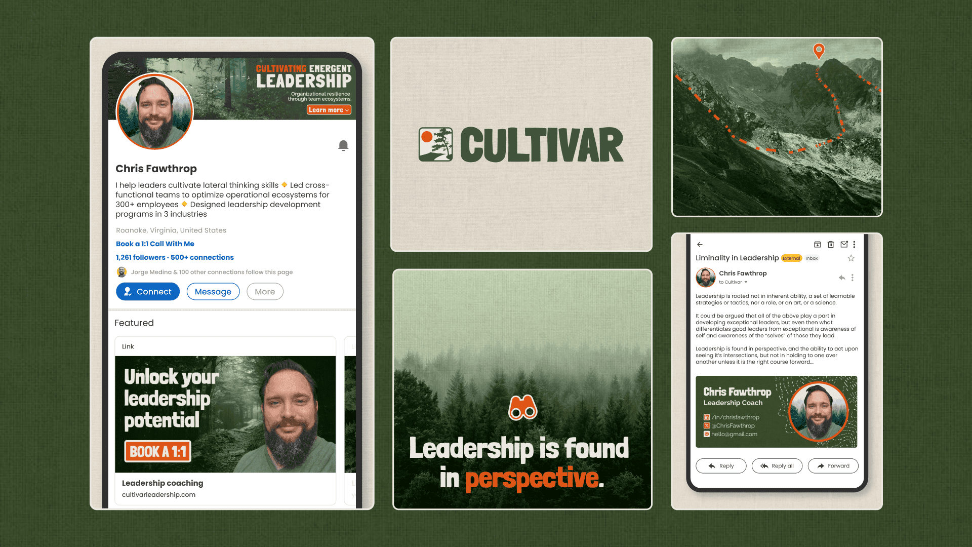
We faced the challenge of bringing to life this distinctive approach through a consistent visual language that would make Cultivar consistently recognizable throughout the different brand touch points.
Solution
Inspired by Chris’ native Blue Ridge mountains and his deep love for the forest we created a National Park-inspired visual identity, positioning Chris and Cultivar as the guide taking his clients through the various ecosystems, uncovering insights as they hit the different milestones on their way to the mountain top. Learning to see and appreciate everything from the minute details of moss, to the intricacies of each individual tree, and the riveting complexity of the breathing forest.
To execute this vision we built the identity around two main pillars:
The colors, aesthetics, and motifs of the Appalachian forest
Chris’ pivotal principle to Cultivar’s perspective on Leadership; the delicate balance needed for a natural ecosystem to thrive. Neither overgrown nor excessively manicured. A whole that blooms through virtue of each healthy individual.
Color
To bring the spirit of the Appalachian forest to life we opted for a muted and dark-leaning color palette, with Hunter Green as the brand color and a rich Flame Orange as the accent color; bringing in a warmth and attention-grabbing contrast (fun fact: this color pick was also inspired by the orange lilies that grow on Chris’ own backyard).
The palette was finished with with an almost beige off-white (Alabaster) and a deep greenish black (Eerie Black) to ensure good contrast and readability on all color combinations.

Typography
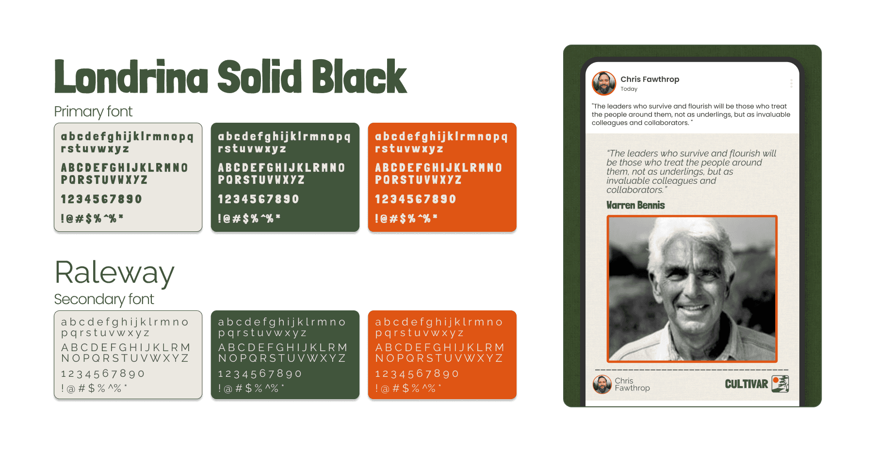
The main typeface Londrina Solid Black was selected as a main feature of the identity for two reasons:
The thickness of its stroke was reminiscent of the national park aesthetic.
Its irregular outlines in contrast with the more straight and ordered layouts of the compositions meant to represent Chris’ principle of the thriving ecosystem; neither overgrown, nor manicured.
It was balanced with Raleway as a neutral secondary typeface with optimal readability that would create a beautiful contrasted balance against the bigger personality of Londrina.
Logo
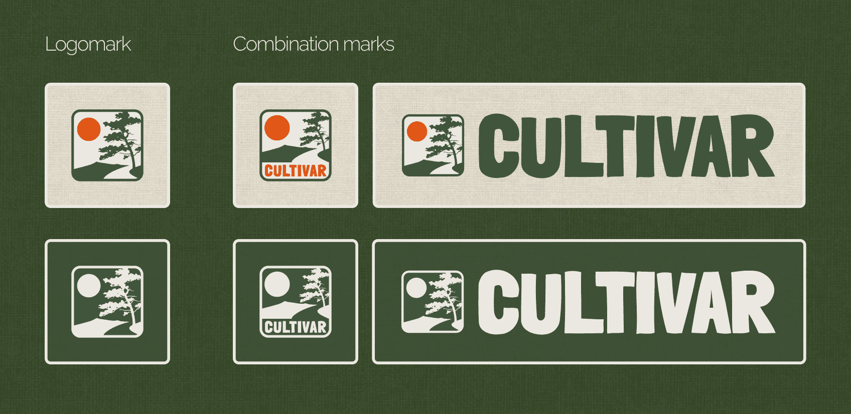
The logo was inspired by national park badges and road signage of the Blue Ridge mountain area. We crafted a personalized logomark illustrating the mountain silhouette and a tree that represented the thriving ecosystem; an irregular silhouette that evoked healthy growth without restrictive manicuring.
The badge-like logo allowed for several flexible presentations to best suit different uses.
Graphic style
Besides the clean and structured compositions that contrasted with the main typeface, we included two key characteristics:
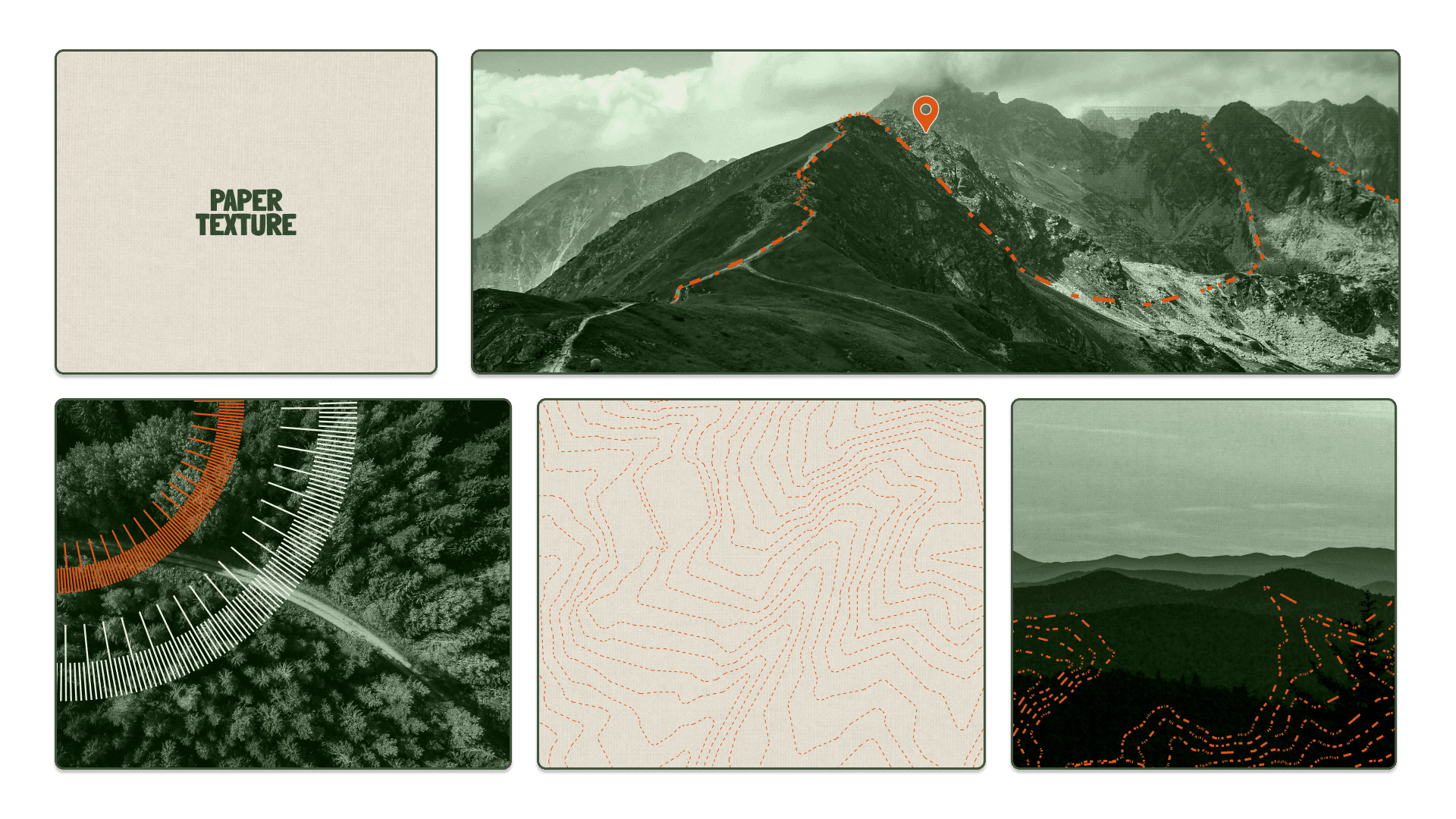
The use of paper texture in the backgrounds to be reminiscent of used maps and add subtle visual interest
The use of custom graphics: elevation lines (from real Blue Ridge area maps), compass lines, dashed mountain silhouettes, and dashed arrow pathways.
Imagery & iconography
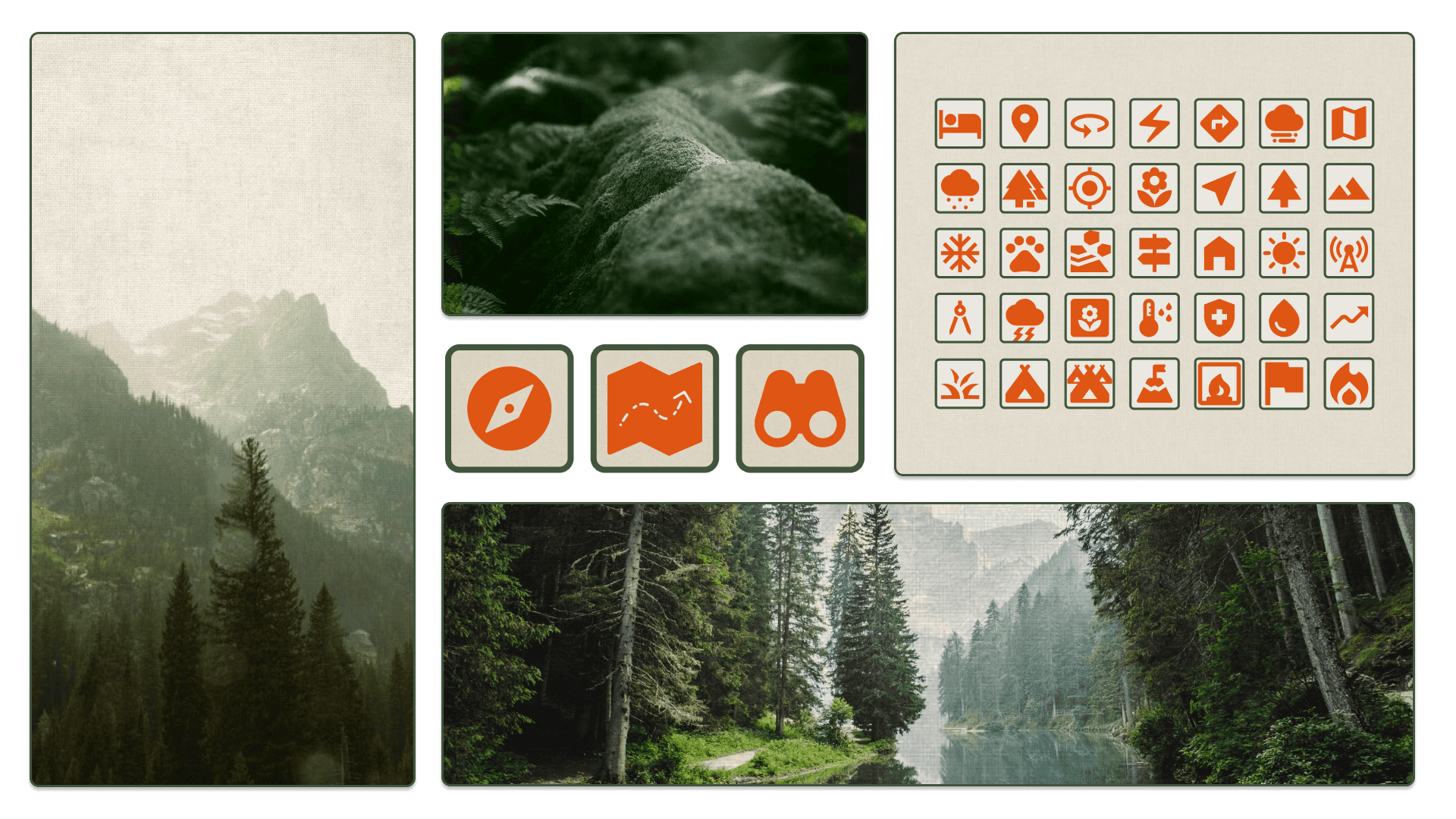
Lastly we built a dedicate assortment of nature photos fitting the aesthetics and a set of custom icon stickers.
The resulting brand identity system allowed to create a complete and ever expansive set of branded assets that will ensure Cultivar remains consistent across its brand touch points.
